Coaching + Brand Identity
Reborn
by Renayliz
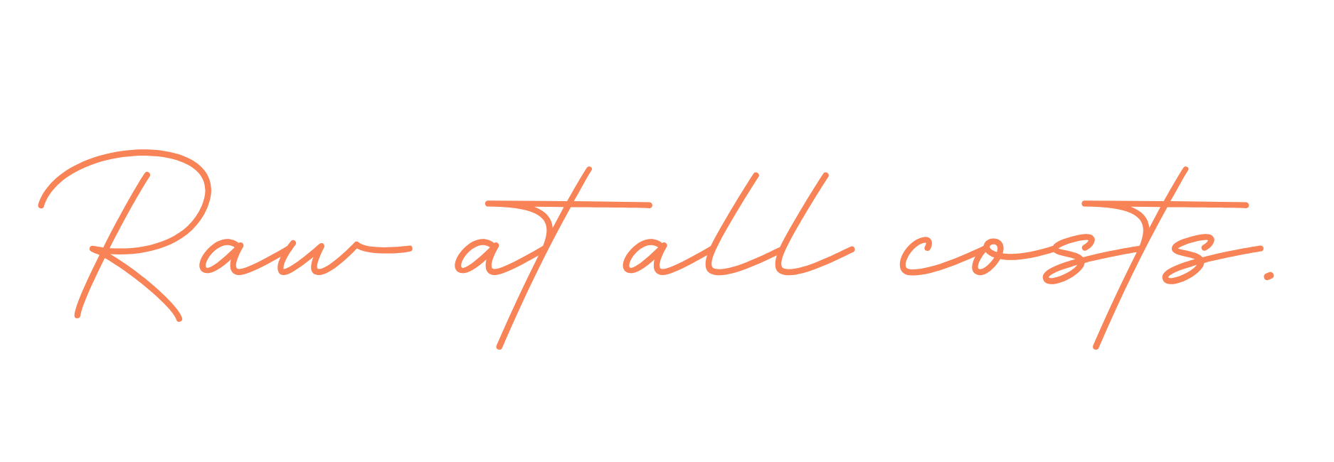
Raw at all costs.
Renee came to us ready for a change but unsure of what that looked like. Over 90 days, we healed what was holding her back, uncovered her true passion, and built a brand around it — one she could launch immediately.
Brand design in collaboration with CK Studio.
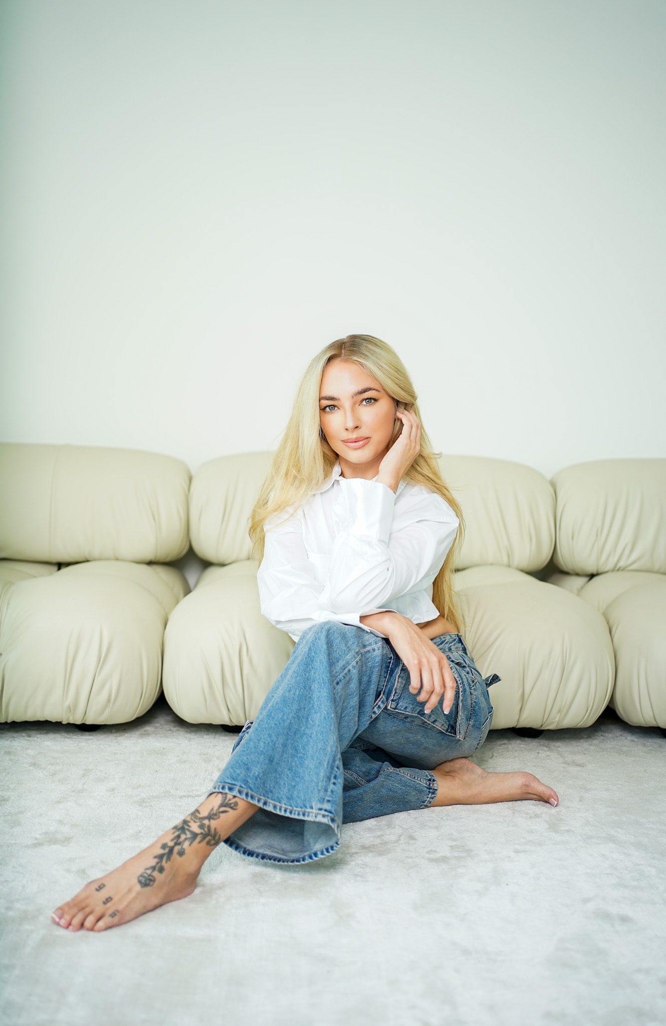
The 90-Day Journey
01
Days 1–30
Heal the Past
We started on the inside. Working through the limiting beliefs, old stories, and mindset blocks that were keeping Renee stuck. This is the work most people skip — we never do.
02
Days 31–60
Find the Passion
With a clearer mind came clarity of purpose. We uncovered what truly lights her up, refined her offer, and defined exactly who she was here to serve.
03
Days 61–90
Build the Brand
We built the Reborn brand identity — messaging, logo, colors, typography, guidelines — the foundation she needed to launch immediately.
She didn't just leave with a brand. She left with a life she actually wanted to live.
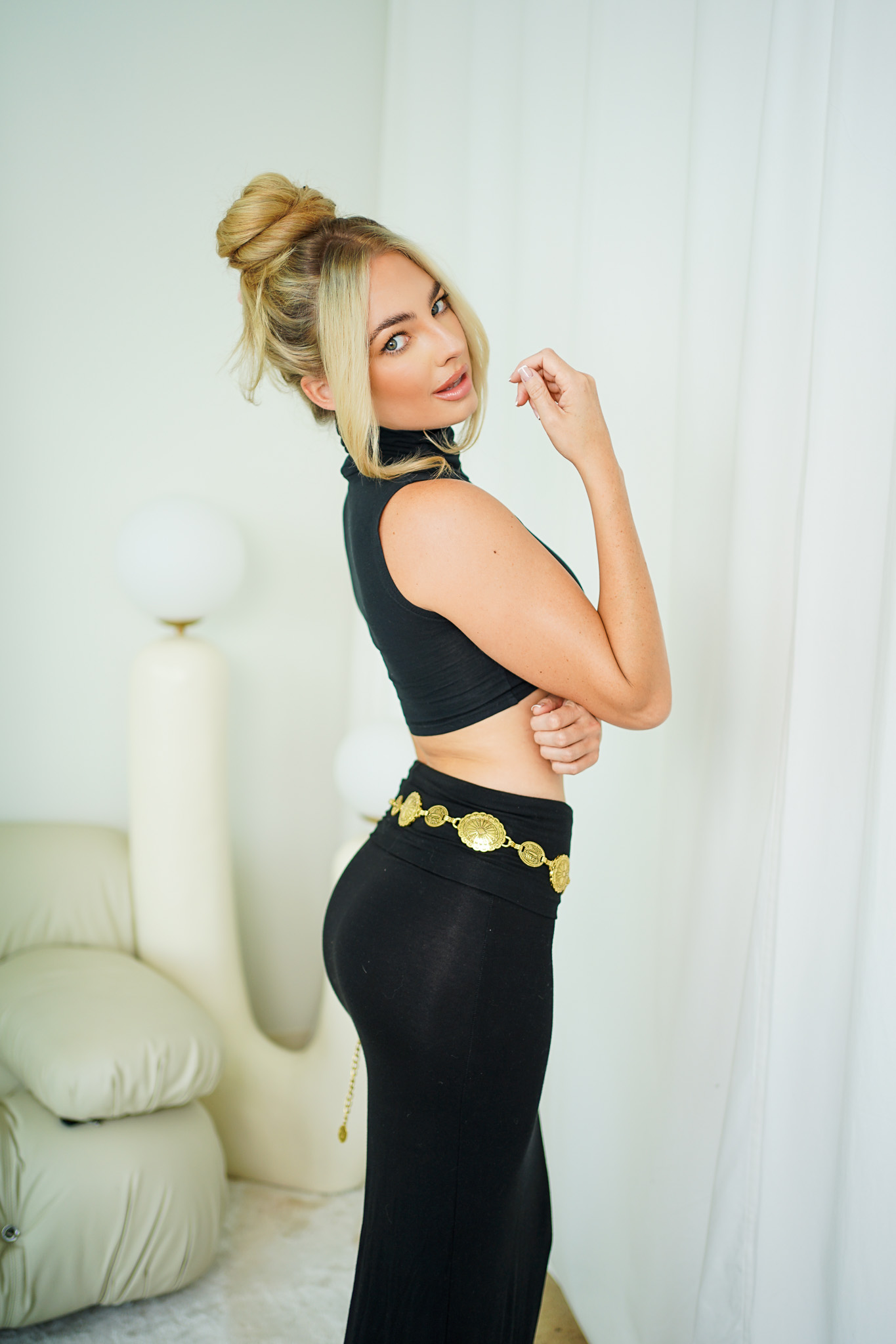
The Brand
Pure living.
Raw at all costs.
Reborn is Renee's platform for non-toxic living — clean beauty, chemical-free household products, and a fresh take on conscious skincare. In a world full of influencers pushing anything for a check, Reborn exists to be the voice you can actually trust.
Soul Brand Process
01
Messaging & Tone
Before a single visual was created, we locked in the voice. Raw at all costs — honest, direct, and real. The kind of energy that makes people feel seen the moment they land on the page.
02
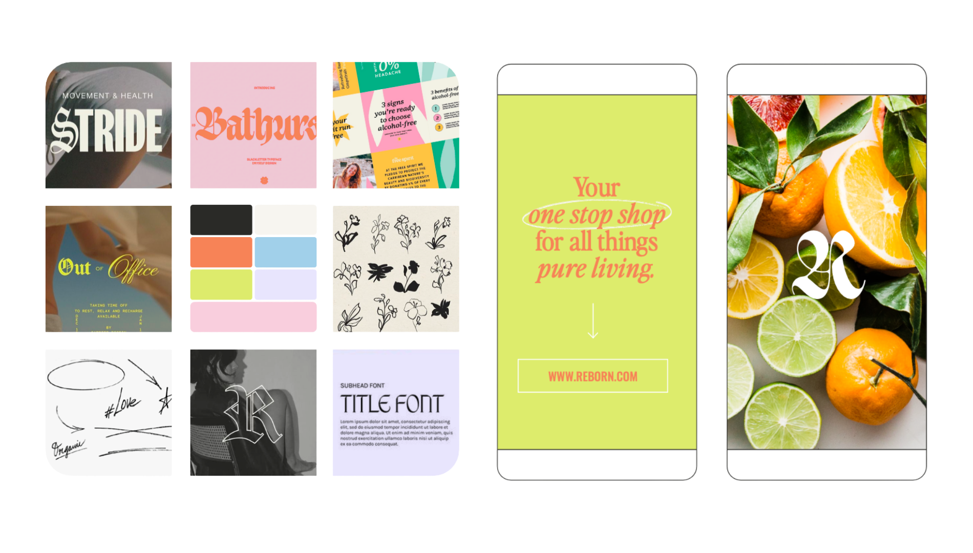
Moodboarding
Visual direction established through a curated moodboard — setting the tone for color, texture, and energy before anything was designed.
03
Handcrafted Logo Design
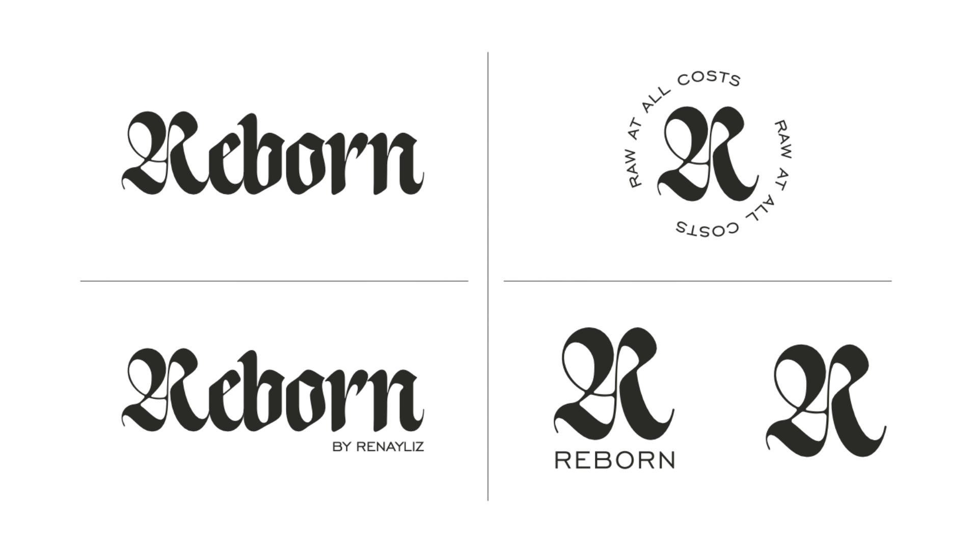
No AI. Every letterform drawn with intention. The blackletter "Reborn" wordmark is bold and edgy — the ornate R acting as a stand-alone mark on its own.
04
Color
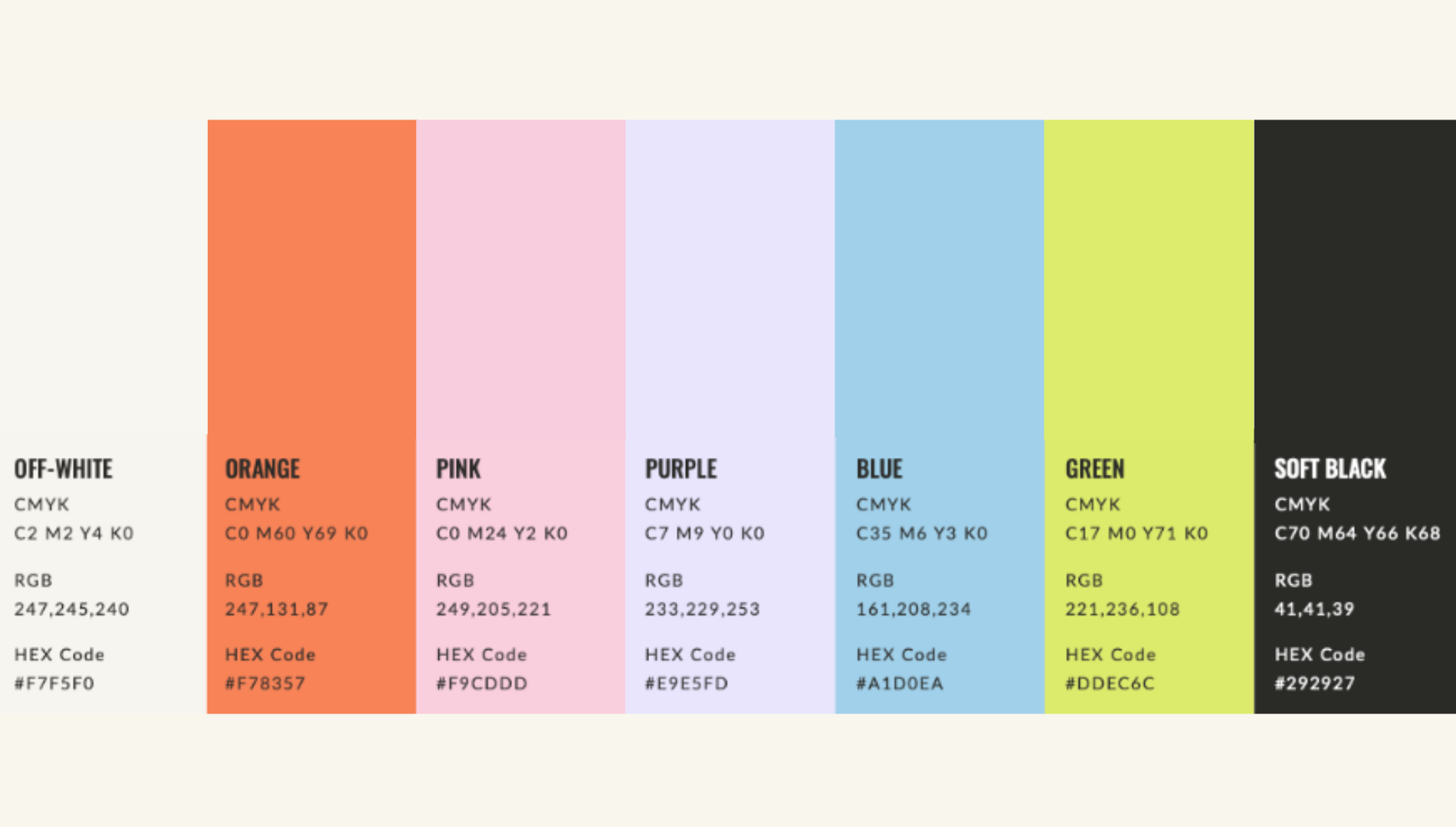
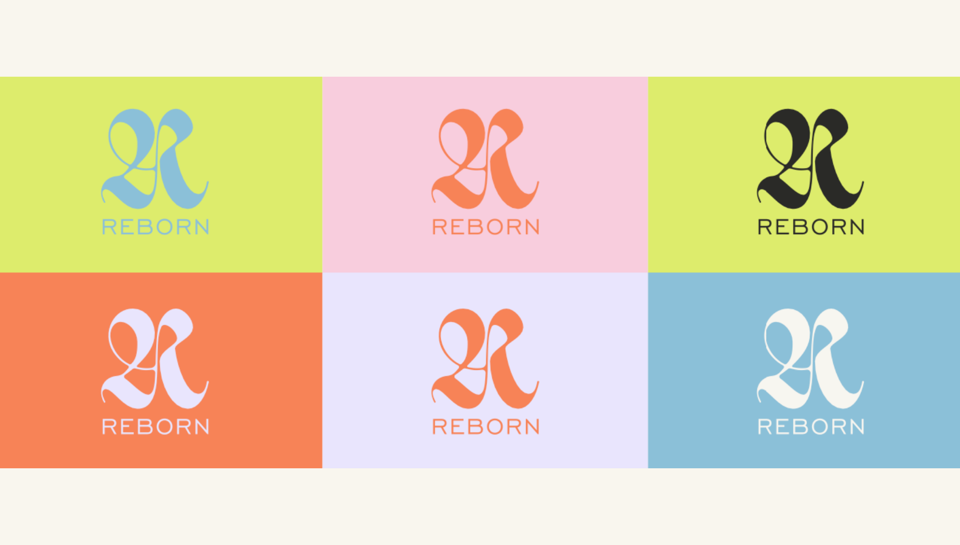
A vibrant, nature-inspired palette — warm orange anchored by chartreuse green, soft blue, lavender, and pink. Bold enough to stand out, warm enough to feel human.
05
Typography
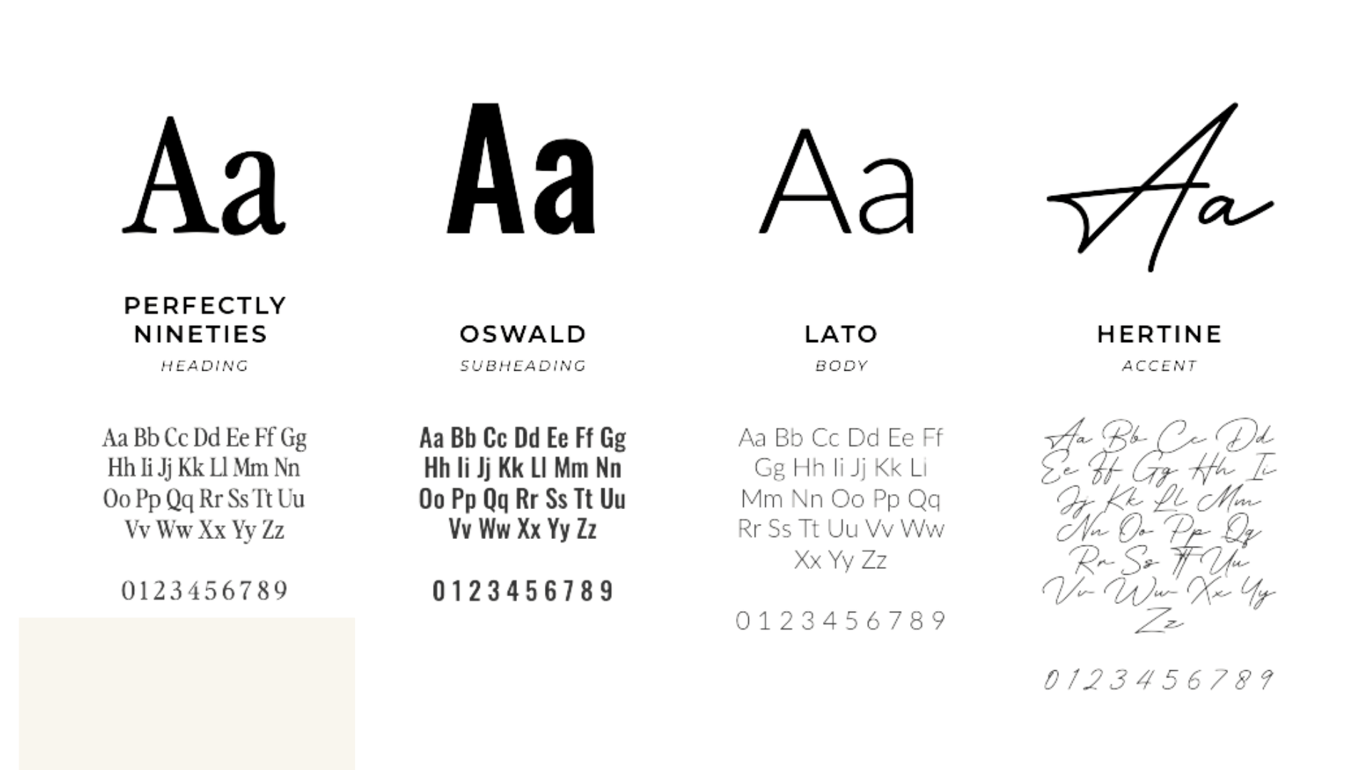
A type system that balances edge with warmth — the blackletter headline paired with clean secondary and accent fonts for maximum versatility.
Photography
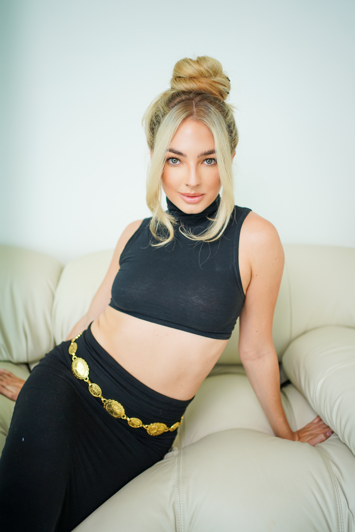
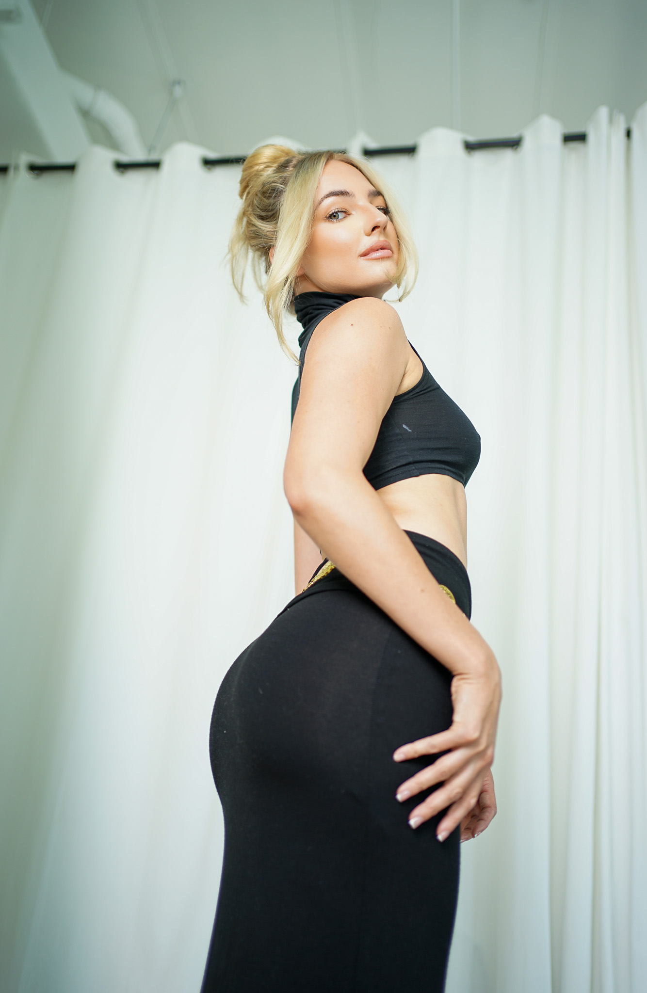
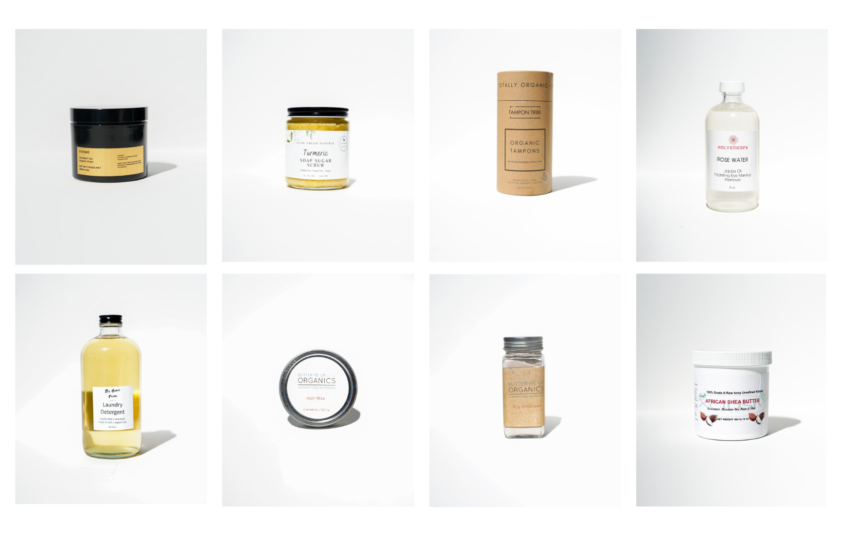

Ready to begin?
Your passion is a brand
waiting to happen.
Start your 90-day journey
Other Projects